Friday, 28 September 2012
Week 9: Refinement
Week 9: Animation
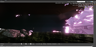
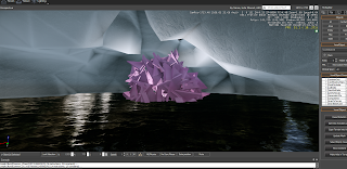
These are some screenshots of the Spawnpoint and Flowgraphs Ive created. I decided for the spawnpoint to start just inside the entrance of the cave, and the flowgraph shows the subtle animations ive created through the floating balls of light-
Flowgraph:
Spawnpoint:
Animation Preview:
Wednesday, 26 September 2012
Week 9: Storyboard
This is a storyboard I sketched up of how I plan to play, view and explore my model-
Start
Storyboard sketch:
Screenshot:
Middle
Storyboard sketch:
Screenshots:
End
Storyboard sketch:
Screenshot:
Monday, 24 September 2012
Week 8: Write Up
I chose to redefine my Asymmetry model, as
that was the model I saw with the most potential to become an inhabitable 3D
space. The major change I made was
changing the model from a grounded pyramid form, to a spherical one- and this
was because it allowed more freedom and opportunity to interact + explore
different views, angles, movements, etc.
After playing around with the model, I decided that it having my model
in an enclosed area (cave) because having it in an open spacious area seemed
too endless, and focus was given to the expansiveness as opposed to the model
itself. To create a more explorable
area, I had to create a directional focus- and the cave gave a path in which to
follow. With a linear track to follow,
you can then focus more on your environment- and a dark cave then only gives
focus on the light objects inside, which in this case was my model. To give a sense of build up to the inhabitor
and a climax to the video, I decided to leave the complete form at the end of
the path and repeat simplified versions and pieces of it through it. Overall, I decided that a very surreal
fantasy landscape would suit my model best and to enhance this notion I decided
to create a very light driven animation & focus. I am considering animating the light forms
inside my model, as well as glowing fragments which surround- as this will help
create a luminous feel, and will again bring focus to my space being explored
and heighten the viewers senses.
Sunday, 23 September 2012
Week 8: Potential animation
Considering what I could do for my animation- I've decided that some subtle animation might be nice, maybe on glowing balls surrounding my model. I will try this next week.
Friday, 21 September 2012
Week 8: Potential Views/ Angles
I've started considering the sort of storyboard I want to extract in my video of the model. Considering start, middle + end I have played with views and angles I want to show during the sequence-
Start:
Start:
Middle:
End:
Week 8: Cave Development
Repetition of model with lights added
Lights added through cave to give seeable path + more pieces added with lights
Rocks added to create more realistic cave-like atmosphere
Balls of light added ready to be animated
Tuesday, 18 September 2012
Week 8: Ideas
After discussing in class, I came up with some sketches + ideas of ways to refine my model to make it better and more inhabitable-
Image: Final Fantasy Dirge of Seberus
Research-
We thought of the idea of having my model (one ball) as the main focus, because any more was too busy- this image displays that technique nicely.Image: Final Fantasy Dirge of Seberus
An idea came up of having the model inside a cave type environment, as that would suit it best- and the darker setting would complement my glowing lights.
Image: Final Fantasy X
This idea of having my model fragmented + scattered around the space also seemed a good way to create new forms + dimensions of my model.
Image: Pokemon Black & White
Image: Pokemon Black & White
When thinking about other aspects that help enhance the model + animation, we thought that playing with/ adding multiple sources of light could be quite effective and improve the overall experience given when exploring the space.
Images: Left- Avatar
Right - KIngdom Hearts
Right - KIngdom Hearts
Monday, 17 September 2012
Week 7: Experimenting with Time of Day
I decided to play with the lighting time of day settings to decide which best enhances the model-
Dawn
Morning
Midday
Dusk
Midnight
Subscribe to:
Comments (Atom)


